
New in v21.2: The Overload dashboard lets you monitor the performance of the parts of your cluster relevant to the cluster's admission control system. This includes CPU usage, the runnable goroutines waiting per CPU, the health of the persistent stores, and the performance of admission control system when it is enabled.
To view this dashboard, access the DB Console, click Metrics in the left-hand navigation, and select Dashboard > Overload.
Dashboard navigation
Use the Graph menu to display metrics for your entire cluster or for a specific node.
To the right of the Graph and Dashboard menus, a range selector allows you to filter the view for a predefined timeframe or custom date/time range. Use the navigation buttons to move to the previous, next, or current timeframe. Note that the active timeframe is reflected in the URL and can be easily shared.
The Overload dashboard displays the following time series graphs:
CPU percent
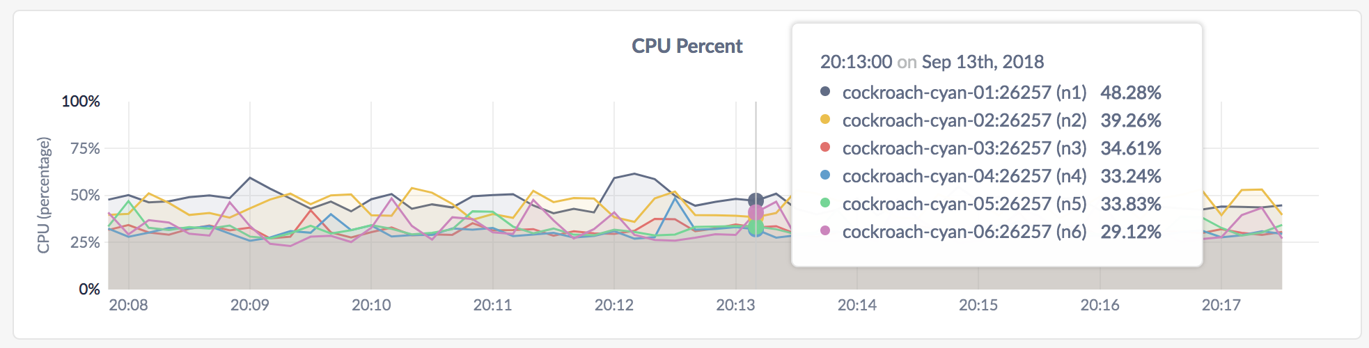
This graph shows the CPU consumption by the CockroachDB process, and excludes other processes on the node. Use a separate monitoring tool to measure the total CPU consumption across all processes.
In the node view, the graph shows the percentage of CPU in use by the CockroachDB process for the selected node.
In the cluster view, the graph shows the percentage of CPU in use by the CockroachDB process across all nodes.
Expected values for a healthy cluster: CPU utilized by CockroachDB should not persistently exceed 80%. Because this metric does not reflect system CPU usage, values above 80% suggest that actual CPU utilization is nearing 100%.
For multi-core systems, the percentage of CPU usage is calculated by normalizing the CPU usage across all cores, whereby 100% utilization indicates that all cores are fully utilized.
Runnable Goroutines per CPU
This graph shows the number of Goroutines waiting to run per CPU. This graph should rise and fall based on CPU load. Values greater than 50 are considered high.
In the node view, the graph shows the number of Goroutines waiting per CPU on the selected node.
In the cluster view, the graph shows the number of Goroutines waiting per CPU across all nodes in the cluster.
LSM L0 Health
This graph shows the health of the persistent stores, which are implemented as log-structured merge (LSM) trees. Level 0 is the highest level of the LSM tree and consists of files containing the latest data written to the Pebble storage engine. For more information about LSM levels and how LSMs work, see Log-structured Merge-trees.
- In the node view, the graph shows the health of the persistent store on the selected node.
- In the cluster view, the graph shows the health of the persistent stores across all nodes in the cluster.
Expected values for a healthy cluster: The number of L0 files should not be in the high thousands. High values indicate heavy write load that is causing accumulation of files in level 0. These files are not being compacted quickly enough to lower levels, resulting in a misshapen LSM.
KV Admission Slots
This graph shows the number of slots used internally by the KV layer of the admission control system. There are lines for available slots and used slots.
KV admission slots are an internal aspect of the admission control system, and are dynamically adjusted to allow for high CPU utilization, but without causing CPU overload. If the used slots are often equal to the available slots, then the admission control system is queueing work in order to prevent overload. A shortage of KV slots will cause queuing not only at the KV layer, but also at the SQL layer, since both layers can be significant consumers of CPU.
- In the node view, the graph shows the number of slots used on the selected node.
- In the cluster view, the graph shows the number of slots used across all nodes in the cluster.
KV Admission IO Tokens Exhausted Duration Per Second
This graph indicates write I/O overload, which affects KV write operations to storage. The admission control system dynamically calculates write tokens (similar to a token bucket) to allow for high write throughput without severely overloading each store. This graph displays the microseconds per second that there were no write tokens left for arriving write requests. When there are no write tokens, these write requests are queued.
- In the node view, the graph shows the number of microseconds per second that there were no write tokens on the selected node.
- In the cluster view, the graph shows the number of microseconds per second that there were no write tokens across all nodes in the cluster.
Admission Work Rate
This graph shows the rate that operations within the admission control system are processed. There are lines for requests within the KV layer, write requests within the KV layer, responses between the KV and SQL layer, and responses within the SQL layer when receiving DistSQL responses.
- In the node view, the graph shows the rate of operations within the work queues on the selected node.
- In the cluster view, the graph shows the rate of operations within the work queues across all nodes in the cluster.
Admission Delay Rate
This graph shows the latency when admitting operations to the work queues within the admission control system. There are lines for requests within the KV layer, write requests within the KV layer, responses between the KV and SQL layer, and responses within the SQL layer when receiving DistSQL responses.
This sums up the delay experienced by operations of each kind, and takes the rate per second. Dividing this rate by the rate observed in the Admission Work Rate graph gives the mean delay experienced per operation.
- In the node view, the graph shows the rate of latency within the work queues on the selected node.
- In the cluster view, the graph shows the rate of latency within the work queues across all nodes in the cluster.
Admission Delay: 75th percentile
This graph shows the 75th percentile of latency when admitting operations to the work queues within the admission control system. There are lines for requests within the KV layer, write requests within the KV layer, responses between the KV and SQL layer, and responses within the SQL layer when receiving DistSQL responses.
This 75th percentile is computed over requests that waited in the admission queue. Work that did not wait is not represented on the graph.
- In the node view, the graph shows the 75th percentile of latency within the work queues on the selected node. Over the last minute the admission control system admitted 75% of operations within this time.
- In the cluster view, the graph shows the 75th percentile of latency within the work queues across all nodes in the cluster. Over the last minute the admission control system admitted 75% of operations within this time.
Summary and events
Summary panel
A Summary panel of key metrics is displayed to the right of the timeseries graphs.
| Metric | Description |
|---|---|
| Total Nodes | The total number of nodes in the cluster. Decommissioned nodes are not included in this count. |
| Capacity Used | The storage capacity used as a percentage of usable capacity allocated across all nodes. |
| Unavailable Ranges | The number of unavailable ranges in the cluster. A non-zero number indicates an unstable cluster. |
| Queries per second | The total number of SELECT, UPDATE, INSERT, and DELETE queries executed per second across the cluster. |
| P99 Latency | The 99th percentile of service latency. |
If you are testing your deployment locally with multiple CockroachDB nodes running on a single machine (this is not recommended in production), you must explicitly set the store size per node in order to display the correct capacity. Otherwise, the machine's actual disk capacity will be counted as a separate store for each node, thus inflating the computed capacity.
Events panel
Underneath the Summary panel, the Events panel lists the 5 most recent events logged for all nodes across the cluster. To list all events, click View all events.
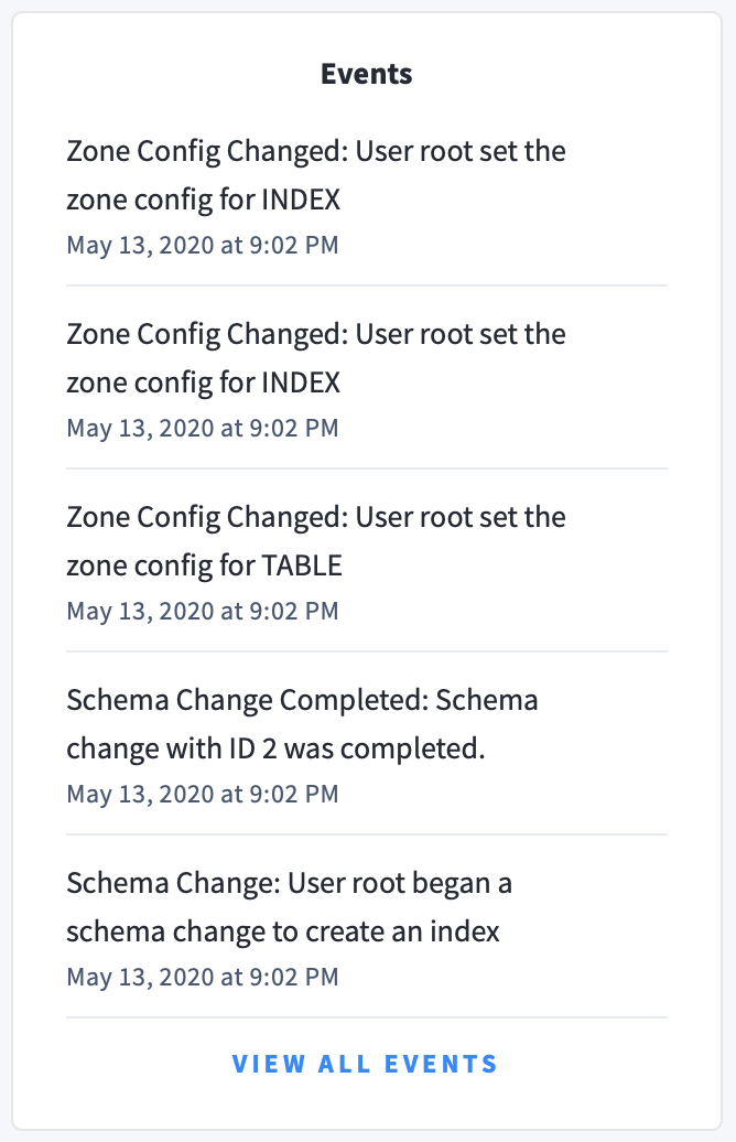
The following types of events are listed:
- Database created
- Database dropped
- Table created
- Table dropped
- Table altered
- Index created
- Index dropped
- View created
- View dropped
- Schema change reversed
- Schema change finished
- Node joined
- Node decommissioned
- Node restarted
- Cluster setting changed
