Last year on the blog, we shared our point of view on product design and research, two of the three main responsibilities of the Design team at Cockroach Labs. The one that we haven’t discussed yet is brand.
Despite having a distinct and memorable name like Cockroach Labs, nailing our brand hasn’t been simple and is still a work-in-progress. From day one, our mission has been to make data easy. But what does a brand that makes data easy look like? That’s the question that keeps the design team up at night.
Eight months ago, we attempted to answer this question in a true startup fashion: pick one aspect of the visual system that’s representative of the brand, launch experiments, and iterate until we find what sticks.
Brand? Brand voice?
Before we dive into the details of our experiment, let’s step back and talk about what brand is and why finding a brand voice matters.
A brand is a lot more than just the logo. It’s a collection of the channels through which a company communicates with you: customer service, price, product quality, experience, advertising, press articles and more.
And regardless of channels, a brand needs a voice: a consistent, purposeful way of expressing itself through words and visuals. The voice creates personality, and it makes the brand alive, and more importantly, opinionated and lovable.
Creating a voice that’s just right for any brand is a daunting challenge, but it’s worthwhile because the voice is the origin of all design inspirations.
Start with blog illustrations
Looking at the various aspect of the visual system, such as typography, color, illustration, iconography, blog illustrations stood out as an ideal playground to explore and evolve our brand voice for a few reasons.
First, the blog posts were by far the most visited pages of the site. The high readership meant we could expect a lot of exposure and feedback from the community. Second, we were using generic, stock photos (if at all) to accompany the content, so the blog posts looked extra-dense and difficult to digest.
Lastly, our blog is a diverse gathering place for stories from how we use our Free Fridays to how to use Kubernetes with CockroachDB. Different illustration styles would fit naturally on the blog accompanying a wide variety of writing styles and stories.
We knew our brand was simply more exciting on its face if supported by strong illustrations. Our hypothesis was that attractive illustrations would lead to increased social media click-through rate, longer engagement on the content, and positive anecdotal feedback from the community.
The results
Eight months since we commissioned the first editorial, we’ve worked with over 25 international illustrators on over 40 illustrations for the blog. And we’ve seen our mission “Make Data Easy” translated through diverse styles. The process was incredibly fun, and we saw some great success.
Looking back at our initial hypothesis, we found that social media posts were read and shared significantly more often when they’re combined with a strong illustration, and our community and candidates have sent encouraging feedback. More importantly, we’ve learned a lot about what connects with the audience, and what works for our brand: literal execution with a clever, thoughtful and humble tone.
Literal representations with a clear focus
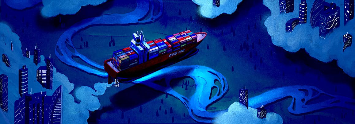
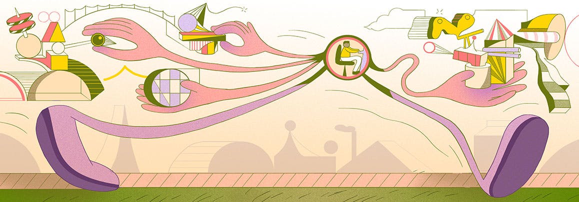
Since most of our blog posts are highly technical, successful illustrations balance the content with a literal representation of the key concepts. Take the multi-cloud deployment piece as an example. Brooklyn-based illustrator Zoë Van Dijk used dramatic lighting on the ship, cleverly named Cloud Line, moving from one cloud world to the other, representing the cloud migration in the most literal sense.
Clever ways to tell a story
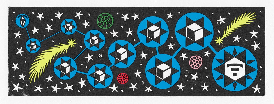
We often tell stories of our product through public announcements, and the stories aren’t necessarily just about one thing. There are many points, angles to cover. And successful illustrations are able to paint the depths of the story. In the story of how our Beta passed the Jepsen test, we surely ran into some hurdles and struggled, and Paris-based illustrator Quentin Vijoux did a stellar job distilling the journey.

Thoughtful use of metaphors
In our culture-related posts, the illustrations can be more playful to tell stories of the people behind the product. And we’re a considerate and respectful bunch, and we want the illustrations to show that via thoughtful and bold use of color and metaphors. In the story of how we’ve updated our engineering interviews to be more fair and reflective of the real world, Toronto-based illustrator Wenting Li linked human arms as bridges to show that we want our candidates to be successful in interviews so we can make better hiring decisions
Learnings and looking forward
Developing a brand voice is difficult, and what we’ve learned is that sometimes the best approach is not to double down on one concept, but to expand our horizon and be willing to try many things at once. Only through exploration, were we able to understand, adapt and grow our brand. The 40 pieces of diverse illustrations have given us a library of inspirations to point to when we discuss brand voice and design directions.
What we learned with illustration has paved the way forward to tackle the other aspects of the brand puzzle: visual design, typography and color. What is an honest, humble typeface for Cockroach Labs? How can we use colors and metaphors effectively throughout the visual system?
In the latest 2.0 updates, we prototyped a way of using open shapes as part of the visual identity for the website. The open shapes are metaphors for open source and friendliness, and the colors we chose are much brighter and bolder, comparing to the dark blue that’s signature to our brand.
And we’re very agile in ditching dated approaches in favor of new ideas, and we’re okay with the fact that we haven’t completely nailed our brand yet, but we know we will, and that makes the journey all the more exciting.
Finally, we’d like to thank all the illustrators we’ve worked with, and honor a few pieces that generated the most discussions and helped push our brand and our design efforts forward.

Best Use of Metaphor by Rebekka Dunlap
Best User of Non-Digital Media by Sophy Hollington
Most Inspired by Burning Man by Dalbert Vilarino

Least Gross Use of a Cockroach by Zach Meyer
Best Use of Technical Detail by Lea Heinrich