When the “worst case scenario” you expected your database to experience someday is unraveling before your eyes, you need performance monitoring software that’s built like a trusty sidekick, ready to help get your database back on track.
That’s why, we’re rethinking our approach to designing monitoring software for mission-critical databases, to create experiences that are intuitive, empowering, and easy for you and your entire team.
As the Senior Product Designer at Cockroach Labs, I’ve been thinking a lot about how to evolve and improve the user experience of our Admin UI, and in doing so, I dove head first into the intricate world of information visualization and the science of perception.
What I’ve learned is that database performance monitoring software should help you do two things really well:
Maintain a level of awareness that allows you to easily spot potential problems before they arise
Provide you with the right insight to take the appropriate actions in preventing problems from happening
But in the real world, performance monitoring software may at times create more noise than clarity, provide you with insufficient context to make informed decisions, and fail at giving you the right tools to take action.
In this blog series, I’ll be summarizing some of the interesting things I’ve come across during my research and we’ll explore some ideas to help us design better experiences for mission-critical software. Each post is focused on a theme:
Clarity of color
Constructing meaning
Encoding for action
Let’s start with Clarity of color.
Too much noise
Take a look at Figure 1, it’s a screenshot of a real-time data visualization with a collection of time-series graphs. It was taken from the popular performance monitoring software Grafana:
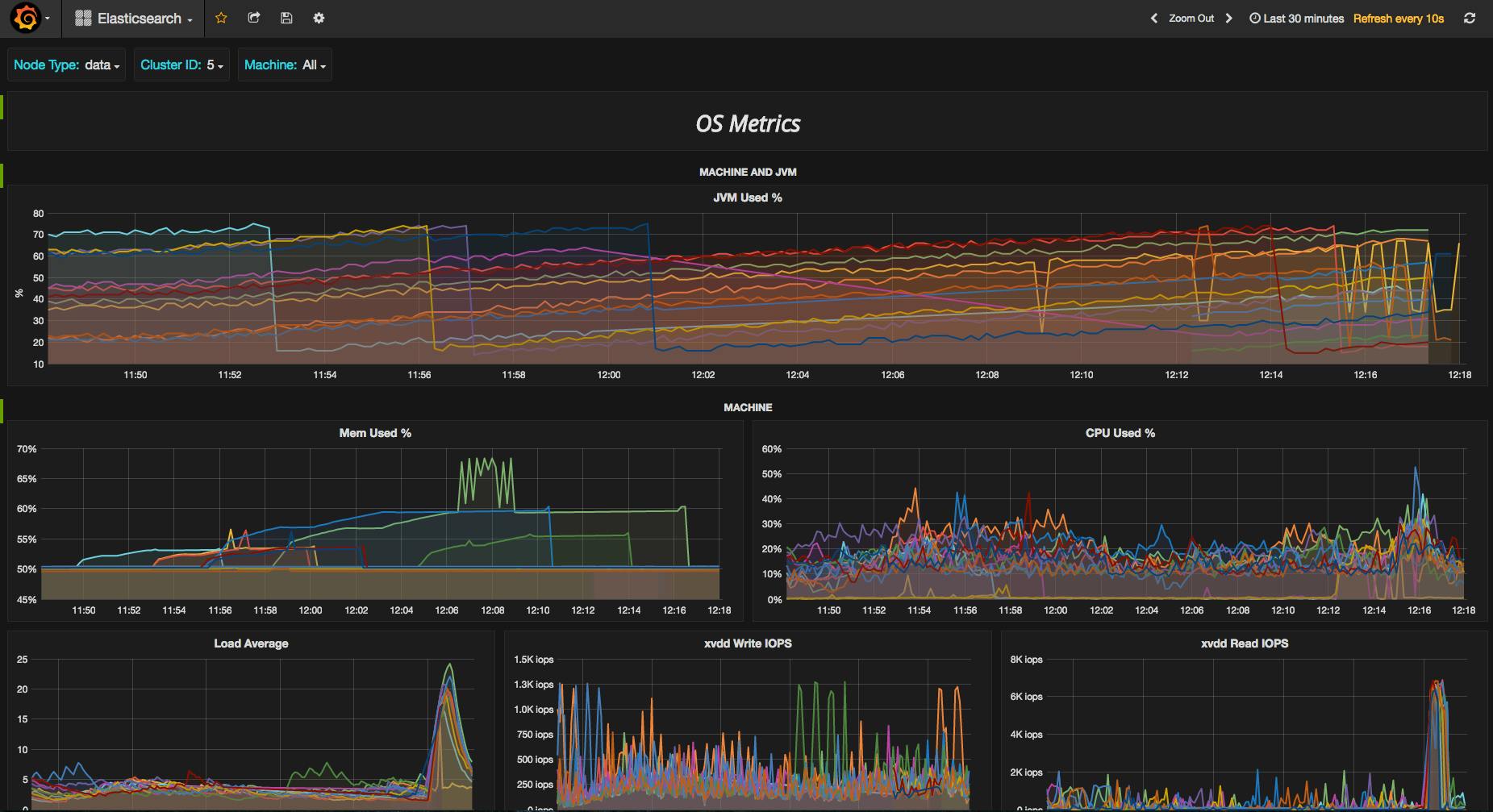
Figure 1 - Taken from the results of a Google search on “Grafana dashboards”. It appears to be a typical time-series performance dashboard created to keep track of a cluster.
It’s pretty, but can you decipher, at a glance, what the most important metric we should be paying attention to is? ⌛Neither can I.
We can dissect all the problems with this dashboard for hours but let’s focus on one aspect that’s creating a lot of noise: color.
Color is irrelevant to much of our normal vision—it doesn't help us determine the layout of objects in space, how they are moving, or what their shapes are (Ware). But color does have a critical function: it helps us see distinction among similar objects, like spotting cherries in a bush:

Figure 2 - Photo of an illustration from Colin Ware’s “Information Visualization”.
During visual perception, a preconscious form of information processing is at work - it’s known as preattentive processing. Certain attributes of what we see are recognized during this processing at extremely high speed, which results in certain objects standing out, all without conscious thought (Ware).
Color is a preattentive attribute that can be effectively used to highlight differences between objects in visualizations. Let’s see another example of how this works. Count how many instances of the number 5 are present:

Okay, try it again:
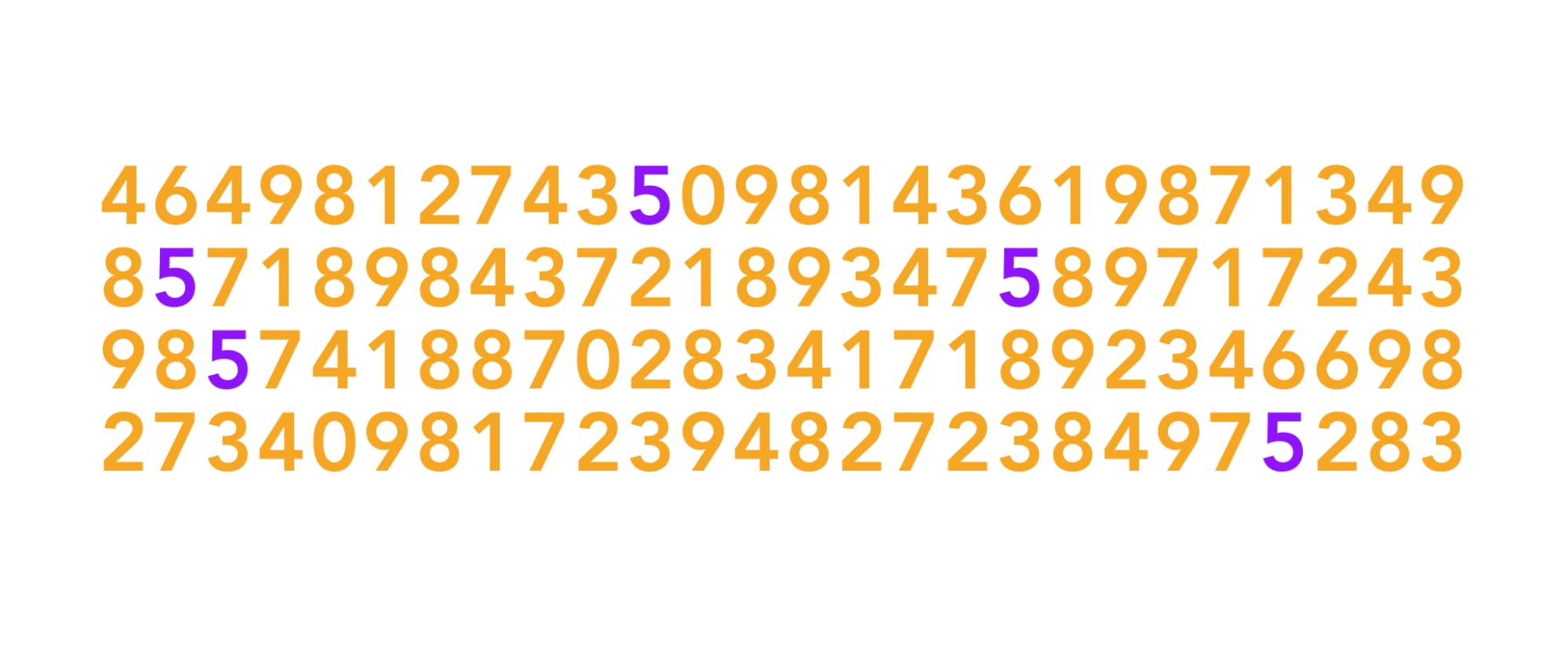
Did you notice the difference? Me too!
Our brain uses the easiest and quickest method to filter out the bits of information that are most likely going to be useful in accomplishing tasks. When we design data visualizations with fast brain systems in mind, users can more easily identify what information they should focus their attention on.
Let’s take a look Figure 5. The contrasting red squares stand out from the field of analogous blue/green ones, and capture your attention first.
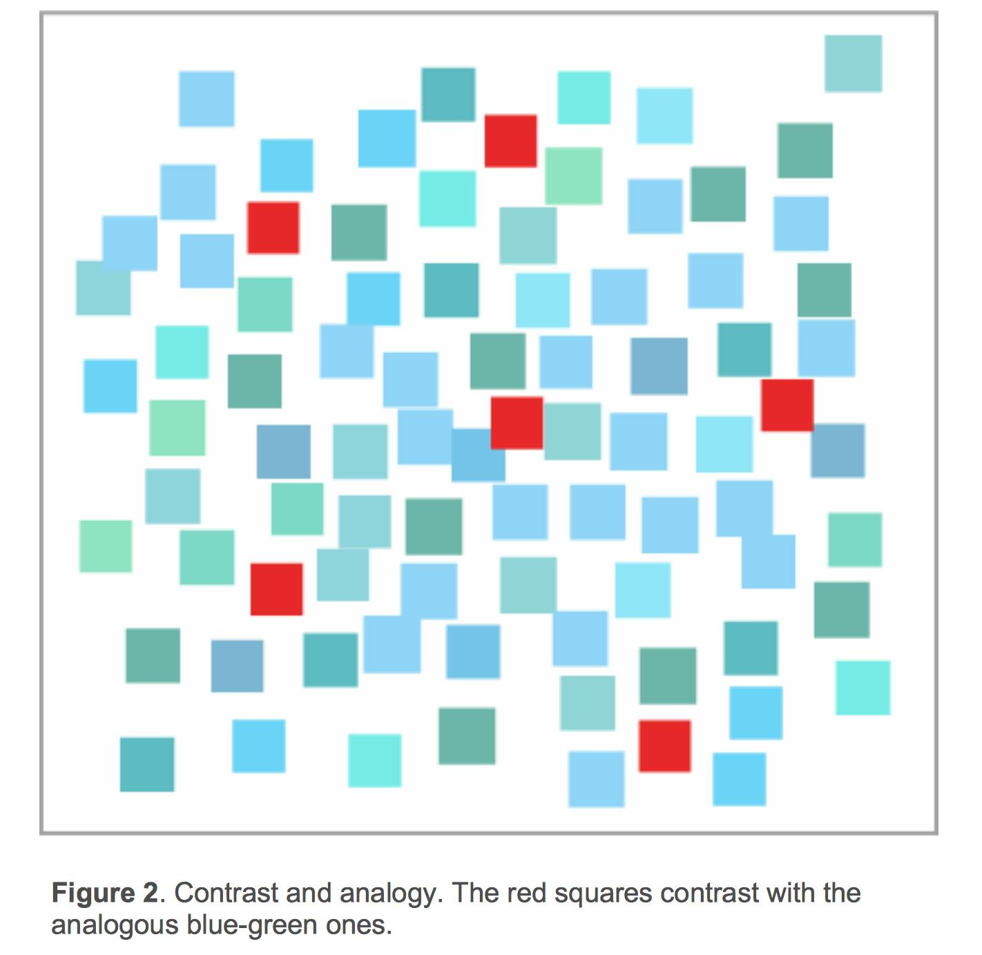
Figure 5: Image taken from “Expert Color Choices for Presenting Data” by Maureen Stone.
Contrast and analogy may be used as design principles to define color. Contrasting color hues are different, analogous hues are similar. Contrast draws attention, analogy groups (Stone).
When designing line graphs for use in time-series monitoring, we need to be careful about the ways in which color is used to encode data.
Encoding data with color
Let’s take a look at Figure 6, a screenshot of a dashboard for the real-time monitoring software Librato Agent.
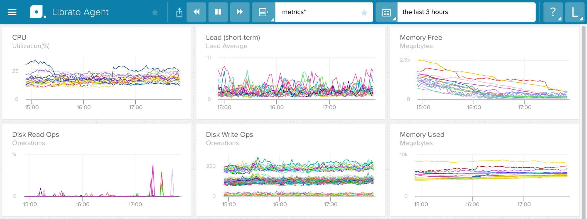
Figure 6: Image taken from the result of a Google search on “time-series monitoring graphs”
Contrasting color hues can create unnecessary noise and result in a visualization that is taxing because it “has too many distinctions for the viewer to be able to sort quickly, thereby requiring careful, conscious, and thus slow examination on the part of the viewer” (IDD).
There are also too many colors being used to represent each line for each time-series graph, such that you’d have to be very attentive to see the differences between them. Due to our limited working memory, qualitatively encoding too many items can make it even more difficult for users to spot the exceptional items that really need attention (Few).
Precisely spotting hue variations of a particular color is not something that humans are very good at doing, let alone quickly (Ware).
Hue
How many different hues of green can you name?
In an interesting study, Post and Green (1986) carried out an experiment on the naming of colors produced on a computer monitor. They generated 210 different colors and asked participants to name the colors they perceived displayed on the monitor. Interestingly, they found that only 8 colors plus white were consistently named with 75% probability:
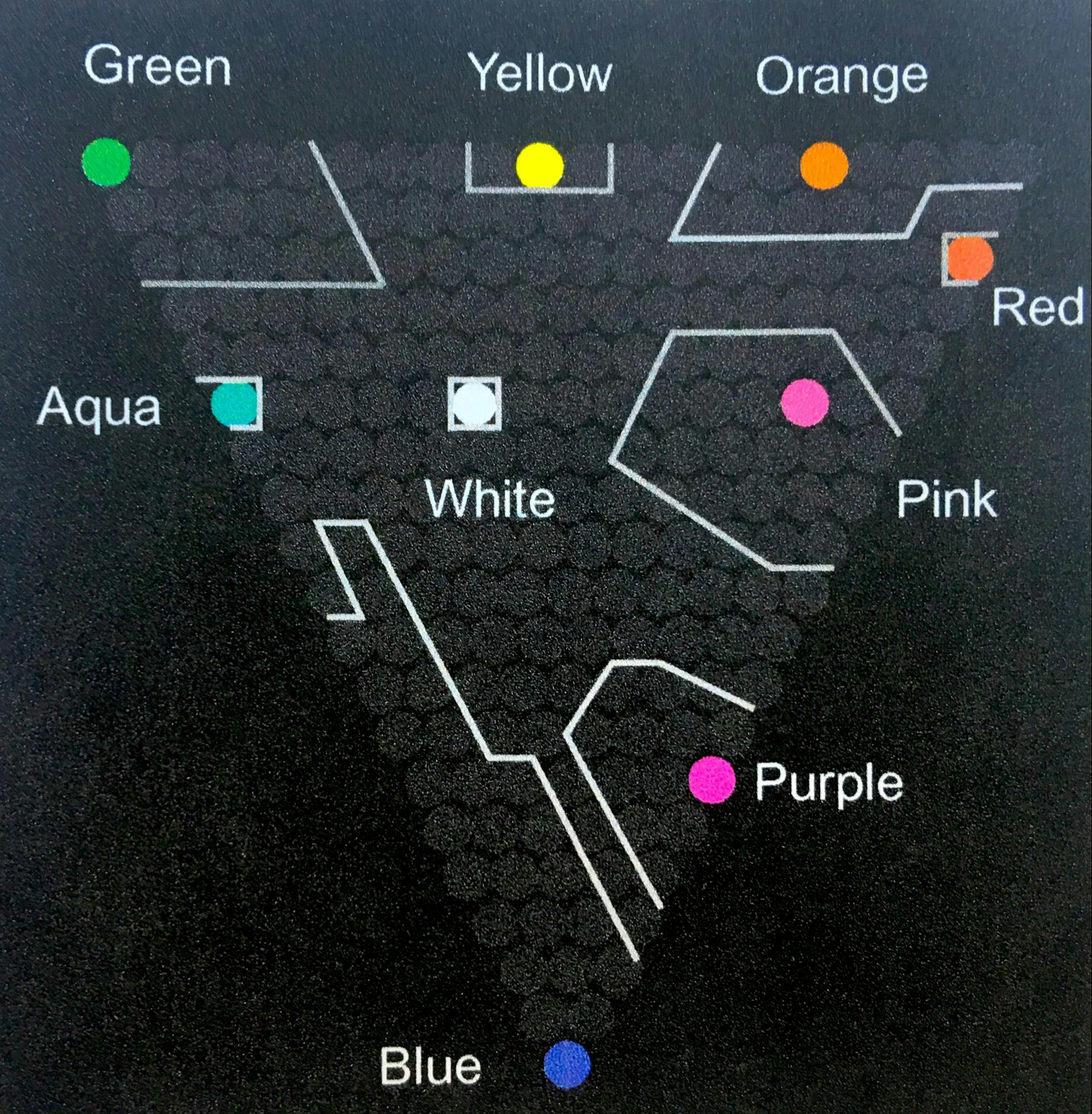
Figure 7: Outlined regions show the colors that were given the same name with bettern than 75% probability.
Although an experiment, the results, and other similar studies, suggest that only a very small number of colors can be used effectively as labels in data visualizations (Ware).
But if hue isn’t going to help users quickly differentiate between different data encodings, what will?
Luminance
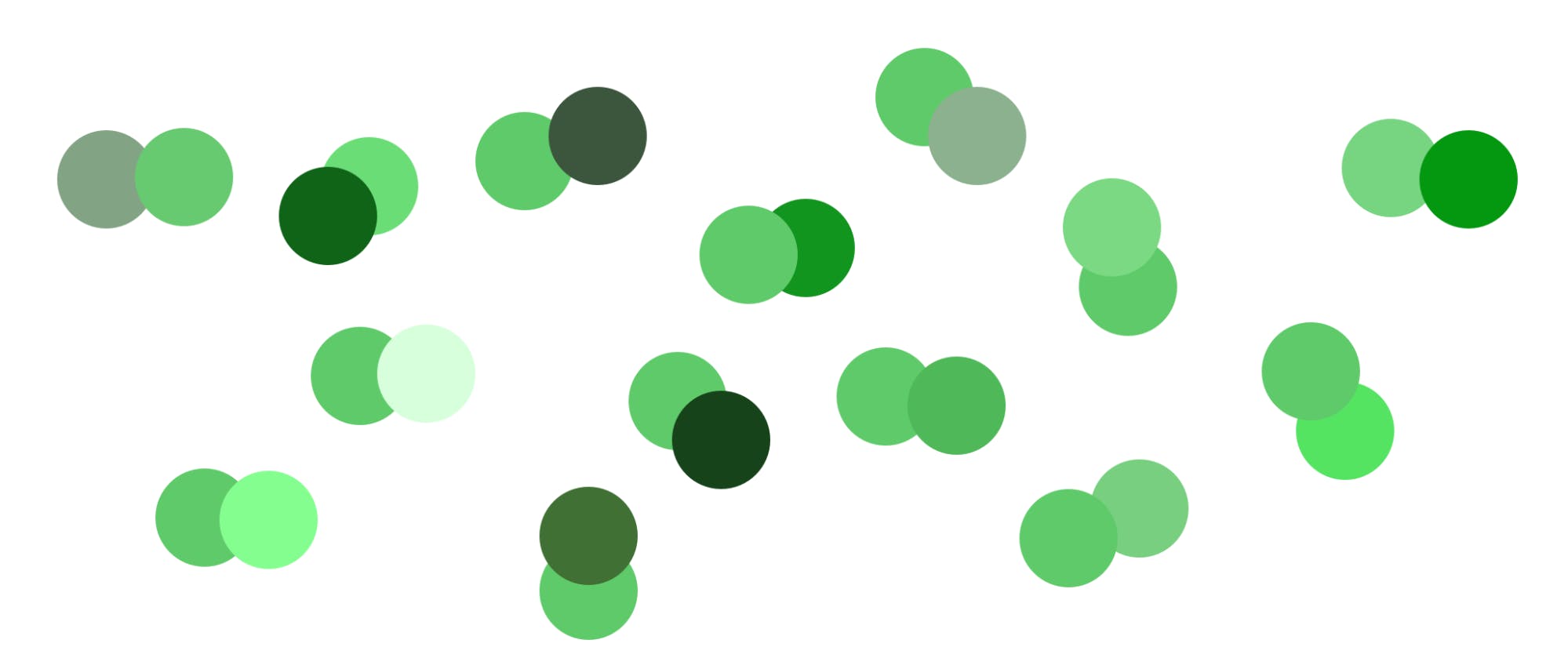
Under normal vision, the human perceptual system is highly tuned to notice slight variations in luminance (Ware). Variation in luminance can be used to separate overlaid objects more clearly, where low contrast layers can sit behind high contrast ones without causing visual clutter (Stone).
Figure 8 demonstrates this principle. (You’ll also notice that hue is not effective at creating the separation between objects.)

Figure 8: Image taken from “Expert Color Choices for Presenting Data” by Maureen Stone.
In terms of color, this means that instead of using variations in hue we can use variations in intensity of a single hue to greater effect (Few).


Even better, variations in the intensity of a single hue are seen as different even by people who are color blind.
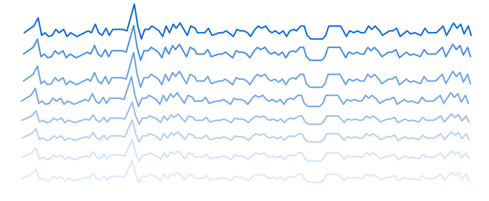
Keep in mind though, when we vary lines in time-series graphs by color intensity, we’re limited to about five different intensities, any more and it becomes difficult for our visual system to distinguish each line (IDD):
Arbitrary Encoding
So what about showing an example that doesn’t look like someone threw up a rainbow? Okay, how about this one from another popular performance monitoring software Datadog:
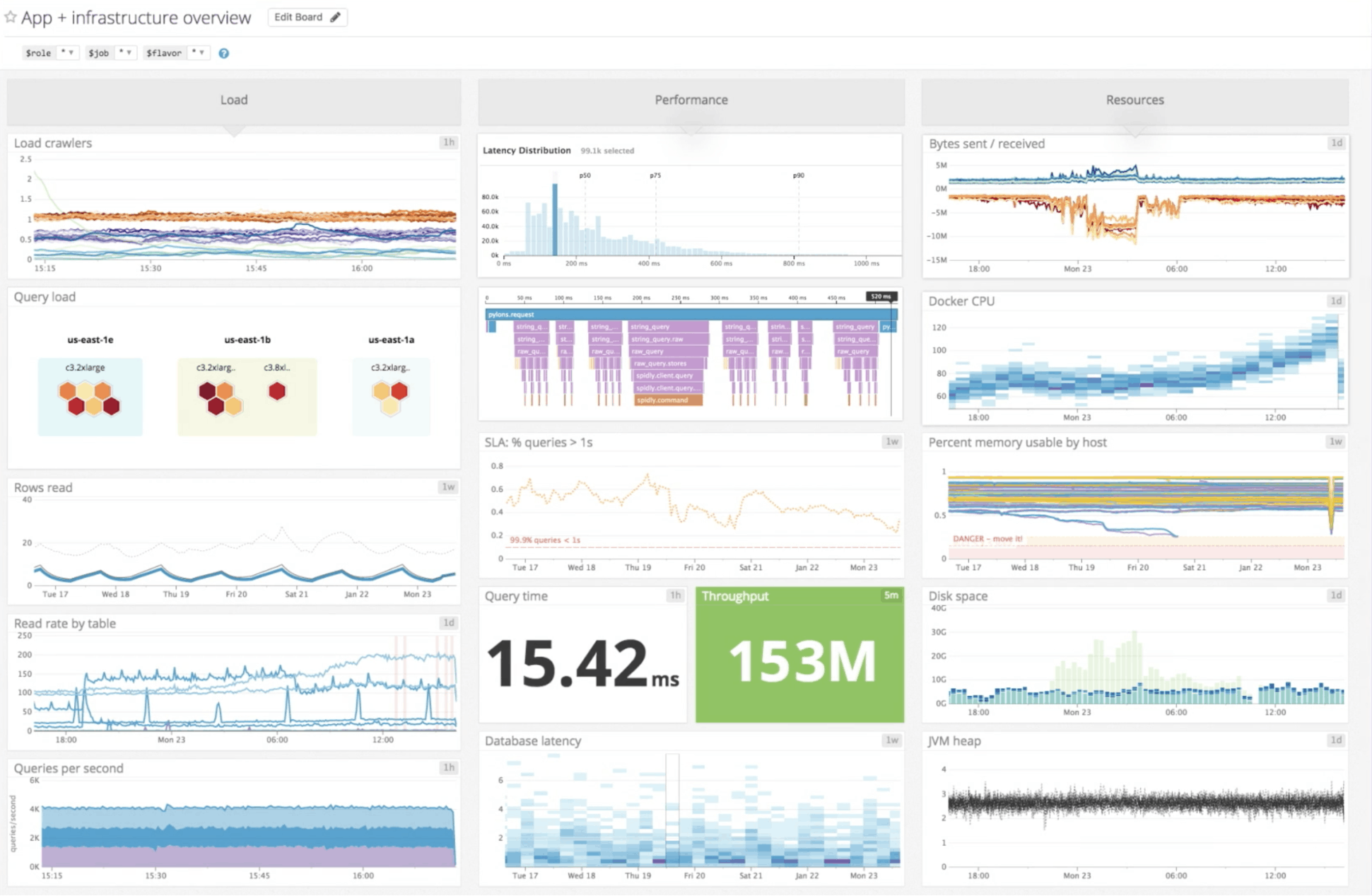
Figure 9: Image was taken from the results of a Google Search on “Datadog dashboard” and shows a typical performance dashboard tracking various database performance metrics
In this example, the color system looks somewhat less haphazard but we’re running into similar problems. The color, in each panel on the dashboard, is arbitrarily encoded from each other panel.
For example, the color blue is used throughout the dashboard to encode different data sets, meaning that in one panel it’s used to encode the frequency for Queries Per Second of a particular machine, and in another panel, it’s used to encode the density of Database Latency values in a heat map. And on top of that, blue is also used for background colors and icon color as well. ¯_(ツ)_/¯
Arbitrarily encoding data with color requires the viewer to focus their attention panel by panel in order to learn the color encoding for each time-series graph. Overtime, for at a glance viewing, the user may learn to discard the color encoding and instead use other visual cues while scanning for things that need attention.
As Moritz Stefaner said “color is difficult,” thus, unfortunately, arbitrary color encoding has become somewhat of a common practice in performance monitoring software. We’re also doing it here at Cockroach Labs :

We can do better, we must do better, to help users maintain the level of awareness needed to spot potential problems before they arise.
Design explorations
As we learned, color has intrinsic qualities that make it good at certain things and bad at others. If we design with our perceptual system in mind, we can create visual color systems that empower users to kick ass at what they do.
Let’s explore some improvement ideas!
What if, most of the color system were grayscale and we used a primary color hue to popout things that require the most attention:
Or we can use the primary color with a simple intensity scale to encode how urgent the alerting is:

Or what if, the data is encoded with with a primary analogous color family of varying intensities, and we use a contrasting secondary color to popout important information:

These are very rough explorations—not answers. But you can see where I’m going with this. There are better ways to create clarity using color than what we currently default to as designers.
And by designing with our perceptual system in mind, we can better help our users maintain the level of awareness needed to easily spot potential problems before they occur.
Summary
Let’s summarize what we learned:
If it’s critical that people pay attention to certain information, create a strong signal to make the information easily stand out against the noise
Our brains are great at thinking faster than we’re conscious of, so use our perceptual system to your advantage when designing
If you’re using color, pay attention to the context in which it’ll be used, and as Edward Tufte said “do no harm”
In the next blog post, let’s chat about how we can help users create meaning out of their database performance metrics, and in the meantime, here’s some great material to check out:
Sources
Tufte, Edward (1990). “Envisioning Information.” Graphics Press, Cheshire, CT
Ware, Colin (2013). “Information Visualization: Perception for design.” Morgan Kaufmann, Amsterdam
Few, Stephen (2013). “Information Dashboard Design: Displaying data for at-a-glance monitoring.” Analytics Press, Burlingame, California
Few, Stephen (2007). “Dashboard Design for Real-Time Situation Awareness.” Perceptual Edge
Weinschenk, Susan M. (2011). “100 Things Every Designer Needs To Know About People.” New Riders, Berkeley, California
Stone, Maureen. “Expert Color Choices for Presenting Data.” http://www.stonesc.com/pubs/Expert%20Color%20Choices.pdf
Illustration by Tiago Galo