

Dashboard navigation
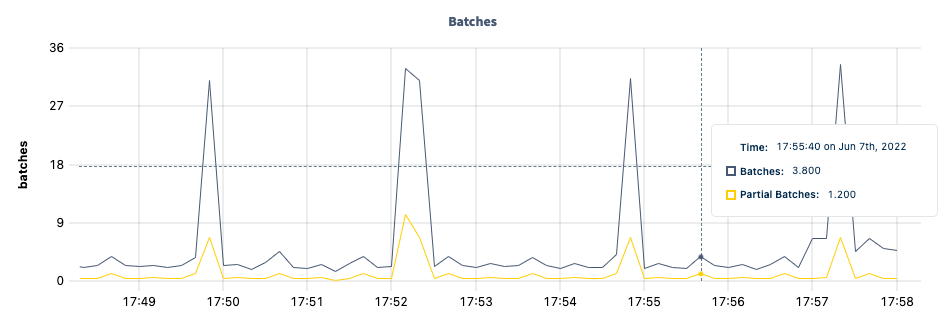
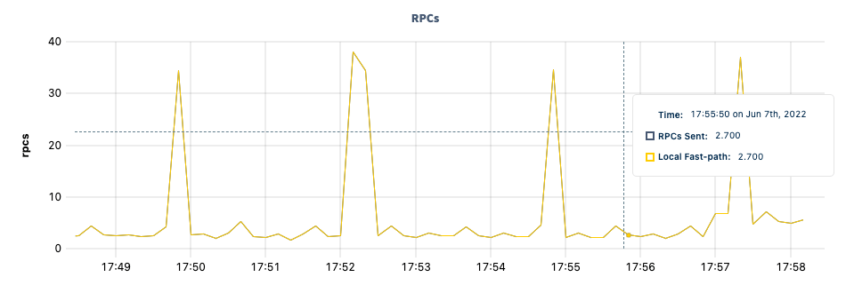
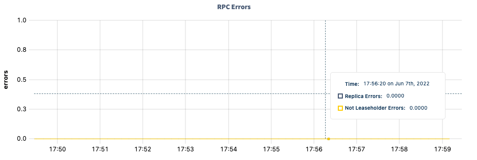
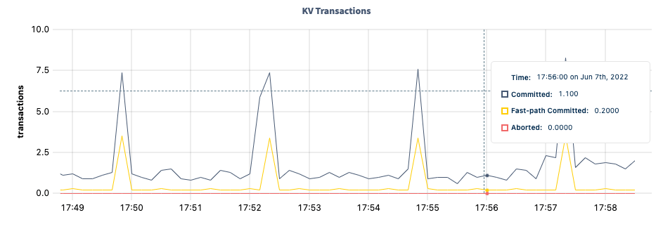
Use the Graph menu to display metrics for your entire cluster or for a specific node. To the right of the Graph and Dashboard menus, a time interval selector allows you to filter the view for a predefined or custom time interval. Use the navigation buttons to move to the previous, next, or current time interval. When you select a time interval, the same interval is selected in the pages. However, if you select 10 or 30 minutes, the interval defaults to 1 hour in SQL Activity pages. When viewing graphs, a tooltip will appear at your mouse cursor providing further insight into the data under the mouse cursor. Click anywhere within the graph to pin the tooltip in place, decoupling the tooltip from your mouse movements. Click anywhere within the graph to cause the tooltip to follow your mouse once more.All timestamps in the DB Console are shown in Coordinated Universal Time (UTC).
Batches
RPCs
RPC Errors
KV Transactions
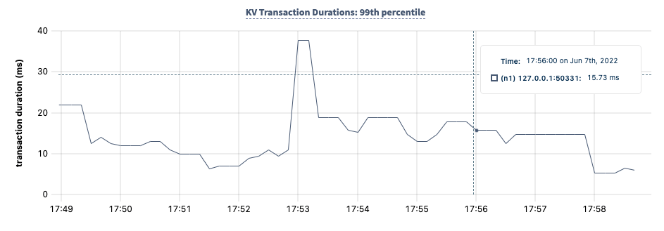
KV Transaction Durations: 99th percentile
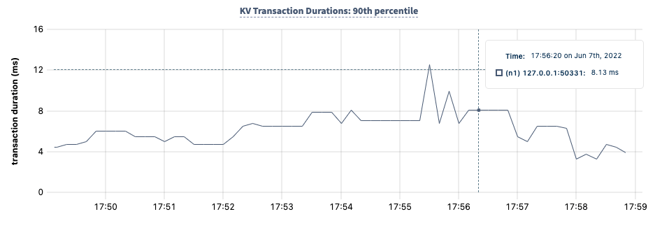
KV Transaction Durations: 90th percentile
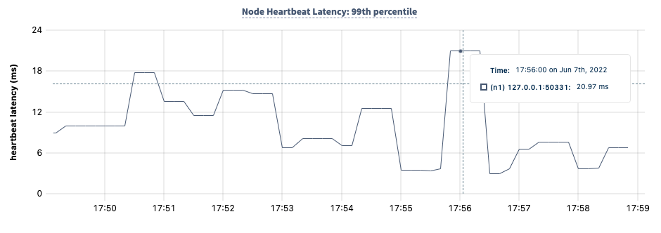
Node Heartbeat Latency: 99th percentile
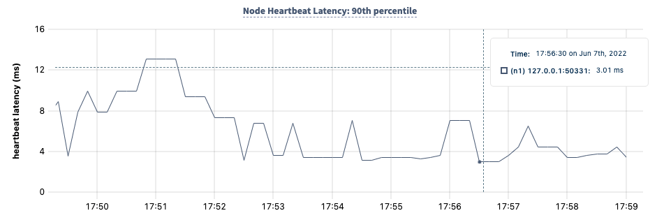
Node Heartbeat Latency: 90th percentile
Summary and events
Summary panel
A Summary panel of key metrics is displayed to the right of the timeseries graphs.
If you are testing your deployment locally with multiple CockroachDB nodes running on a single machine (this is ), you must explicitly per node in order to display the correct capacity. Otherwise, the machine’s actual disk capacity will be counted as a separate store for each node, thus inflating the computed capacity.
Events panel
Underneath the Summary panel, the Events panel lists the 5 most recent events logged for all nodes across the cluster. To list all events, click View all events.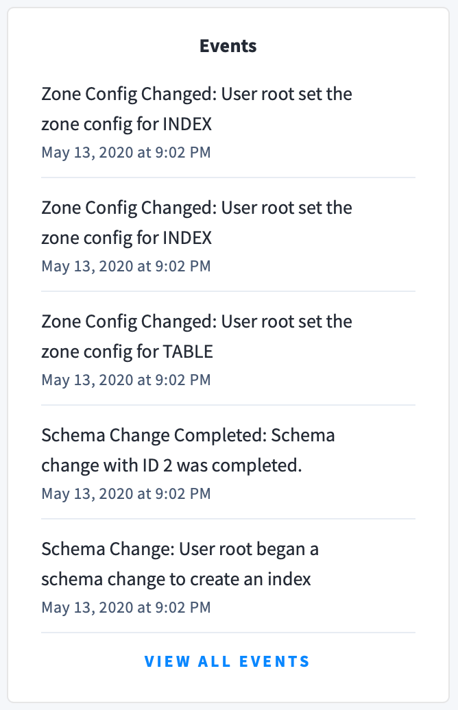
- Database created
- Database dropped
- Table created
- Table dropped
- Table altered
- Index created
- Index dropped
- View created
- View dropped
- Schema change reversed
- Schema change finished
- Node joined
- Node decommissioned
- Node restarted
- Cluster setting changed