The Queues dashboard lets you monitor the health and performance of various queueing systems in CockroachDB. To view this dashboard, and click Metrics on the left-hand navigation, and then select Dashboard > Queues.

Dashboard navigation

Use the Graph menu to display metrics for your entire cluster or for a specific node. To the right of the Graph and Dashboard menus, a time interval selector allows you to filter the view for a predefined or custom time interval. Use the navigation buttons to move to the previous, next, or current time interval. When you select a time interval, the same interval is selected in the pages. However, if you select 10 or 30 minutes, the interval defaults to 1 hour in SQL Activity pages. Hovering your mouse pointer over the graph title will display a tooltip with a description and the used to create the graph. When hovering on graphs, crosshair lines will appear at your mouse pointer. The series’ values corresponding to the given time in the cross hairs are displayed in the legend under the graph. Hovering the mouse pointer on a given series displays the corresponding value near the mouse pointer and highlights the series line (graying out other series lines). Click anywhere within the graph to freeze the values in place. Click anywhere within the graph again to cause the values to change with your mouse movements once more. In the legend, click on an individual series to isolate it on the graph. The other series will be hidden, while the hover will still work. Click the individual series again to make the other series visible. If there are many series, a scrollbar may appear on the right of the legend. This is to limit the size of the legend so that it does not get endlessly large, particularly on clusters with many nodes.
All timestamps in the DB Console are shown in Coordinated Universal Time (UTC).
The Queues dashboard displays the following time series graphs:

Queue Processing Failures

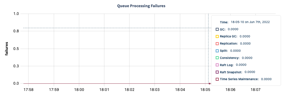
DB Console queue failures graph The Queue Processing Failures graph displays processing failures experienced across various queuing systems. Hovering over the graph displays values for the following metrics:

Queue Processing Times

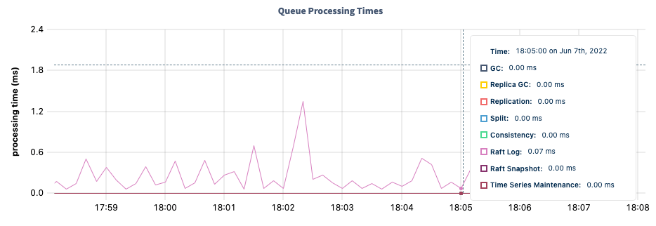
DB Console queue processing time graph The Queue Processing Times graph displays the processing rate across various queue systems. Hovering over the graph displays values for the following metrics:

Replica GC Queue

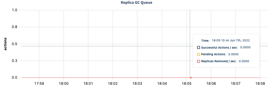
DB Console replica GC queue graph The Replica GC Queue graph displays various details about the health and performance of the replica garbage collection queue. Hovering over the graph displays values for the following metrics:

Replication Queue

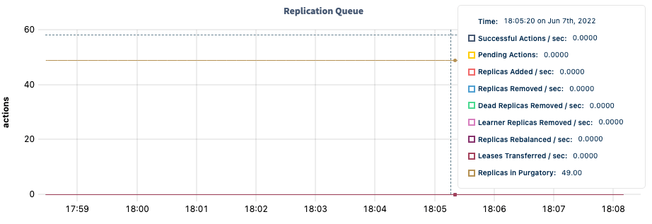
DB Console replication queue graph The Replication Queue graph displays various details about the health and performance of the replication queue. Hovering over the graph displays values for the following metrics:

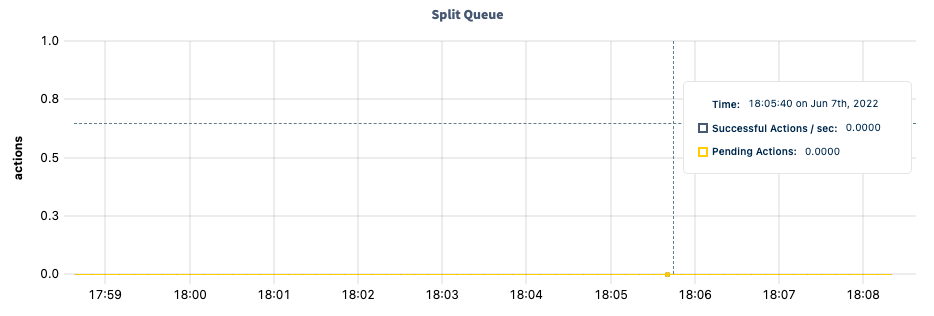
Split Queue

DB Console split queue graph The Split Queue graph displays various details about the health and performance of the split queue. Hovering over the graph displays values for the following metrics:

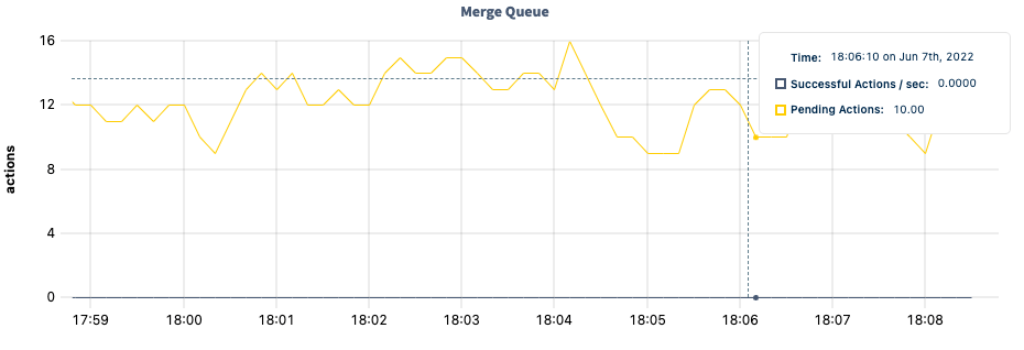
Merge Queue

DB Console merge queue graph The Merge Queue graph displays various details about the health and performance of the merge queue. Hovering over the graph displays values for the following metrics:

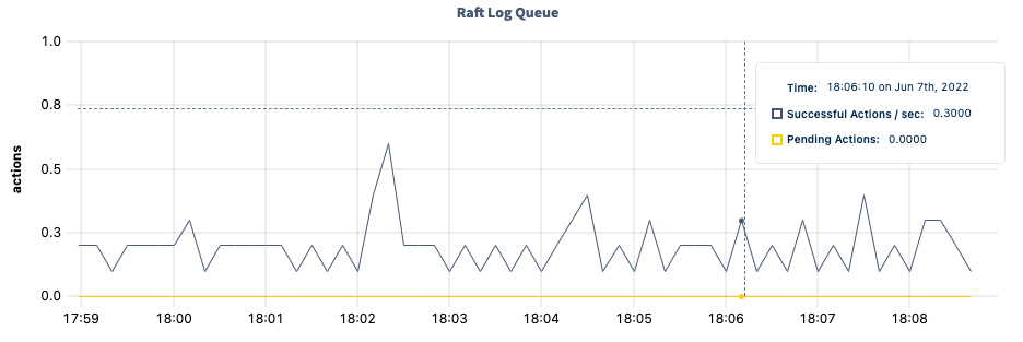
Raft Log Queue

DB Console Raft log queue graph The Raft Log Queue graph displays various details about the health and performance of the Raft log queue. Hovering over the graph displays values for the following metrics:

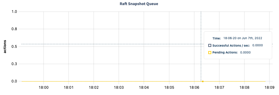
Raft Snapshot Queue

DB Console Raft snapshot queue graph The Raft Snapshot Queue graph displays various details about the health and performance of the Raft repair queue. Hovering over the graph displays values for the following metrics:

Consistency Checker Queue

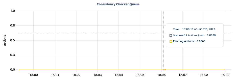
DB Console consistency checker queue graph The Consistency Checker Queue graph displays various details about the health and performance of the consistency checker queue. Hovering over the graph displays values for the following metrics:

Time Series Maintenance Queue

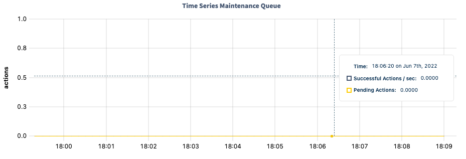
DB Console time series maintenance queue graph The Time Series Maintenance Queue graph displays various details about the health and performance of the time series maintenance queue. Hovering over the graph displays values for the following metrics:

MVCC GC Queue

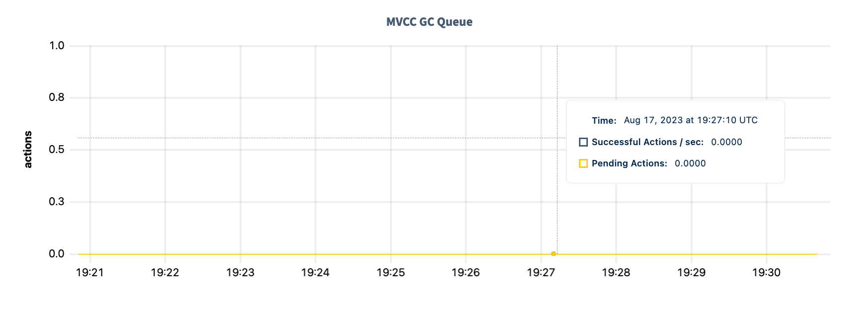
DB Console GC queue graph The MVCC GC Queue graph displays various details about the health and performance of the queue. Hovering over the graph displays values for the following metrics:

Protected Timestamp Records

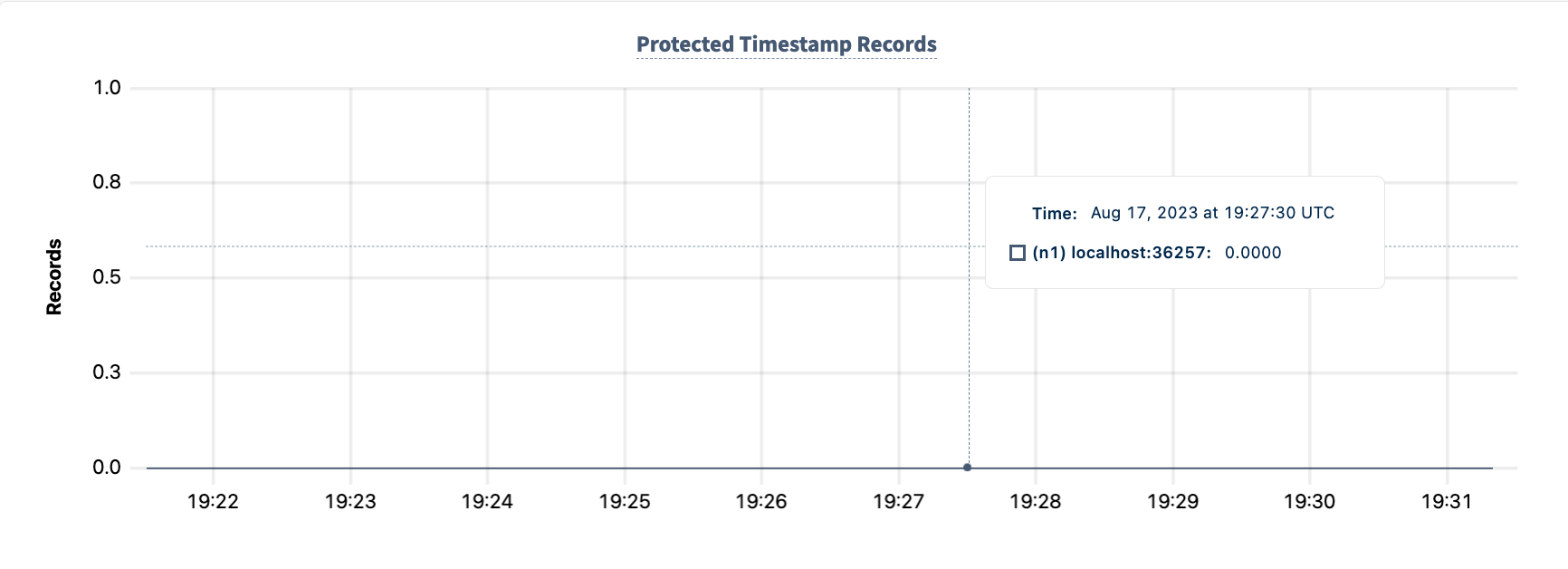
DB Console GC queue graph The Protected Timestamp Records graph displays the number of records (used by backups, changefeeds, etc. to prevent MVCC GC) per node, as tracked by the spanconfig.kvsubscriber.protected_record_count metric.

Summary and events

Summary panel

A Summary panel of key metrics is displayed to the right of the timeseries graphs. If you are testing your deployment locally with multiple CockroachDB nodes running on a single machine (this is ), you must explicitly per node in order to display the correct capacity. Otherwise, the machine’s actual disk capacity will be counted as a separate store for each node, thus inflating the computed capacity.

Events panel

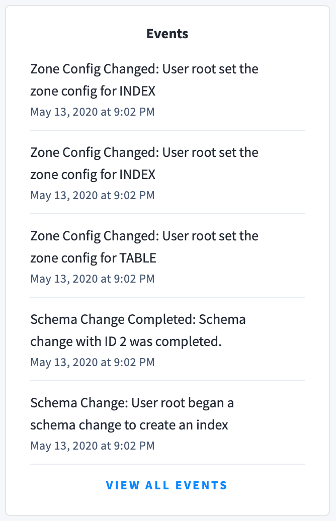
Underneath the Summary panel, the Events panel lists the 5 most recent events logged for all nodes across the cluster. To list all events, click View all events. DB Console Events The following types of events are listed:
  • Database created
  • Database dropped
  • Table created
  • Table dropped
  • Table altered
  • Index created
  • Index dropped
  • View created
  • View dropped
  • Schema change reversed
  • Schema change finished
  • Node joined
  • Node decommissioned
  • Node restarted
  • Cluster setting changed

See also