

Dashboard navigation
Use the Graph menu to display metrics for your entire cluster or for a specific node. To the right of the Graph and Dashboard menus, a time interval selector allows you to filter the view for a predefined or custom time interval. Use the navigation buttons to move to the previous, next, or current time interval. When you select a time interval, the same interval is selected in the pages. However, if you select 10 or 30 minutes, the interval defaults to 1 hour in SQL Activity pages. Hovering your mouse pointer over the graph title will display a tooltip with a description and the used to create the graph. When hovering on graphs, crosshair lines will appear at your mouse pointer. The series’ values corresponding to the given time in the cross hairs are displayed in the legend under the graph. Hovering the mouse pointer on a given series displays the corresponding value near the mouse pointer and highlights the series line (graying out other series lines). Click anywhere within the graph to freeze the values in place. Click anywhere within the graph again to cause the values to change with your mouse movements once more. In the legend, click on an individual series to isolate it on the graph. The other series will be hidden, while the hover will still work. Click the individual series again to make the other series visible. If there are many series, a scrollbar may appear on the right of the legend. This is to limit the size of the legend so that it does not get endlessly large, particularly on clusters with many nodes. The Changefeeds dashboard displays the following time series graphs:Changefeed Status
This graph displays the status of all running changefeeds.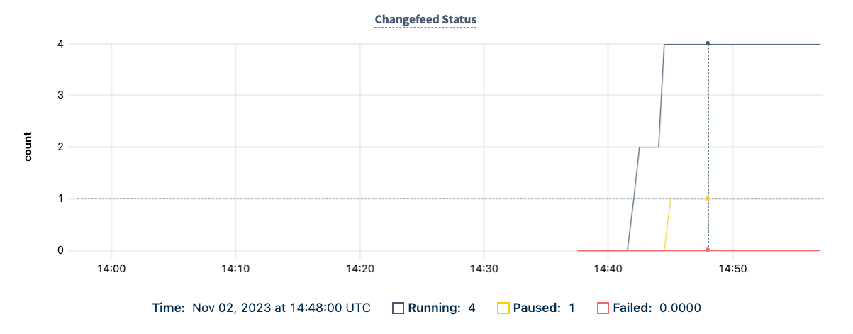
Refer to and to manage a changefeed.
In the case of a failed changefeed, you may want to use the option to restart the changefeed. Refer to the example.
Commit Latency
This graph displays the 99th, 90th, and 50th percentile of commit latency for running changefeeds. This is the difference between an event’s MVCC timestamp and the time it was acknowledged as received by the .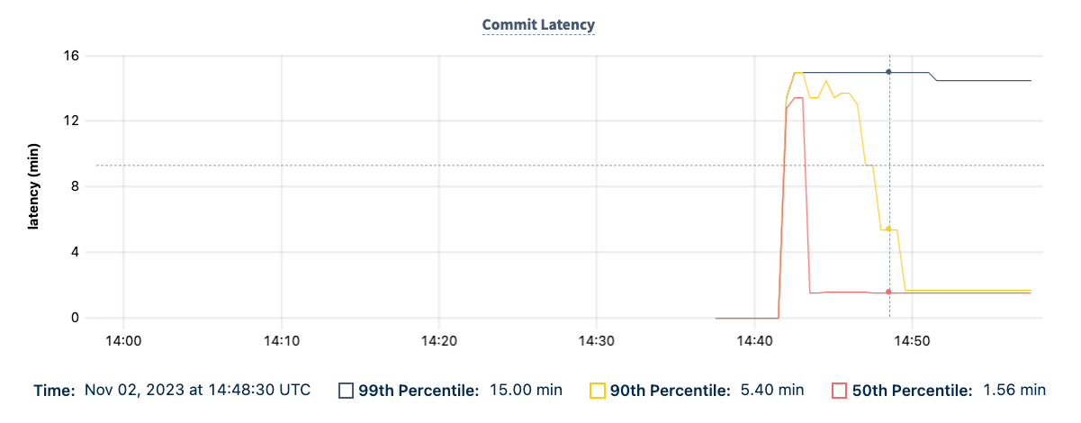
Emitted Bytes
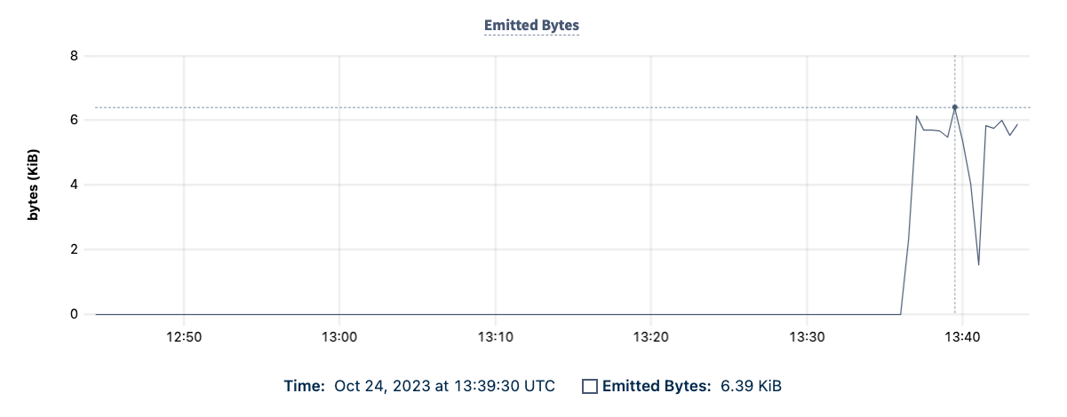
This graph shows the number of bytes emitted by CockroachDB into the changefeed’s .In v23.1 and earlier, the Emitted Bytes graph was named Sink Byte Traffic. If you want to customize charts, including how metrics are named, use the .
Sink Counts
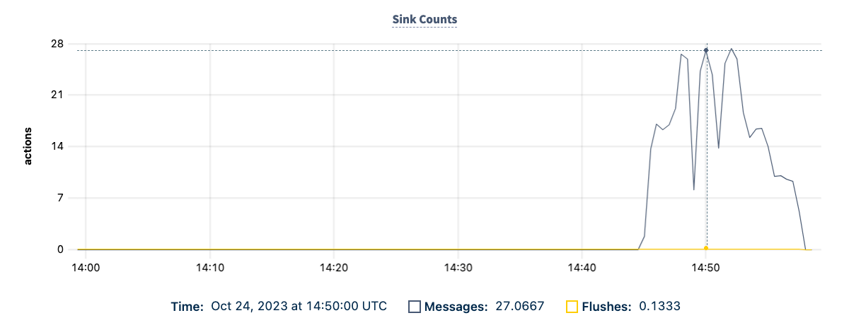
This graph displays data relating to the number of messages and flushes at the changefeed sink.- The number of messages that CockroachDB sent to the sink.
-
The number of flushes that the sink performed for changefeeds.
Max Checkpoint Latency
This graph displays the most any changefeed’s persisted is behind the present time. Larger values indicate issues with successfully ingesting or emitting changes. If errors cause a changefeed to restart, or the changefeed is and unpaused, emitted data up to the last checkpoint may be re-emitted.In v23.1 and earlier, the Max Checkpoint Latency graph was named Max Changefeed Latency. If you want to customize charts, including how metrics are named, use the .
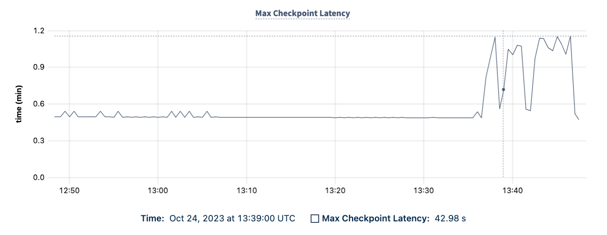
The maximum checkpoint latency is distinct from, and slower than, the commit latency for individual change messages. For more information about resolved timestamps, refer to the page.
Changefeed Restarts
This graph displays the number of times changefeeds restarted due to .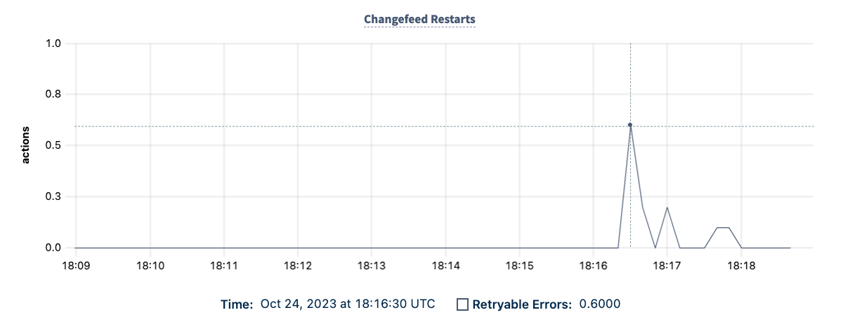
Oldest Protected Timestamp
This graph displays the oldest of any running changefeed on the cluster.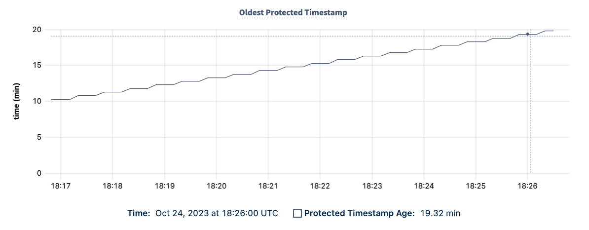
Backfill Pending Ranges
This graph displays the number of ranges being backfilled that are yet to enter the changefeed pipeline. An or can cause a backfill.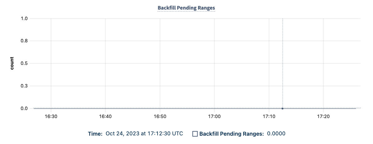
Schema Registry Registrations
This graph displays the rate of schema registration requests made by CockroachDB nodes to a configured schema registry endpoint. For example, a pointing to a .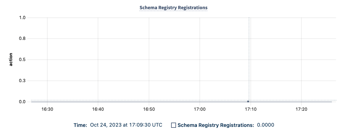
Ranges in catchup mode
This graph displays the total number of ranges with an active that is performing a catchup scan.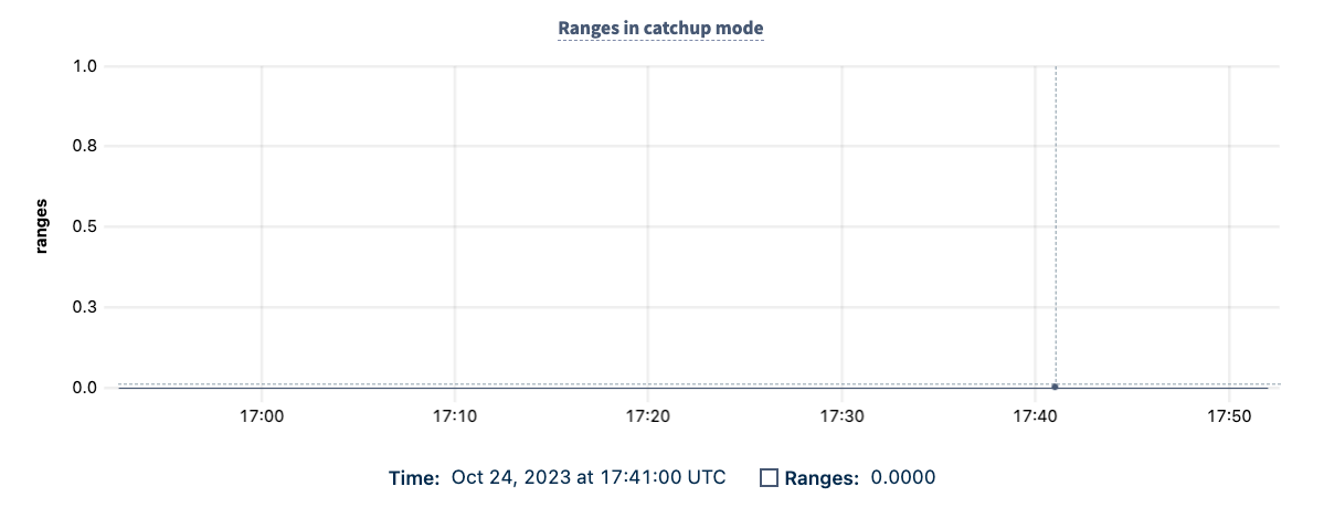
Rangefeed Catchup Scans Duration
This graph displays the duration of catchup scans that changefeeds are performing.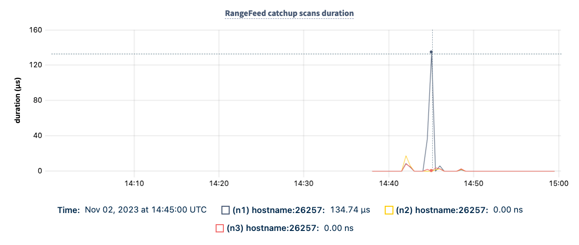
Summary and events
Summary panel
A Summary panel of key metrics is displayed to the right of the timeseries graphs.
If you are testing your deployment locally with multiple CockroachDB nodes running on a single machine (this is ), you must explicitly per node in order to display the correct capacity. Otherwise, the machine’s actual disk capacity will be counted as a separate store for each node, thus inflating the computed capacity.
Events panel
Underneath the Summary panel, the Events panel lists the 5 most recent events logged for all nodes across the cluster. To list all events, click View all events.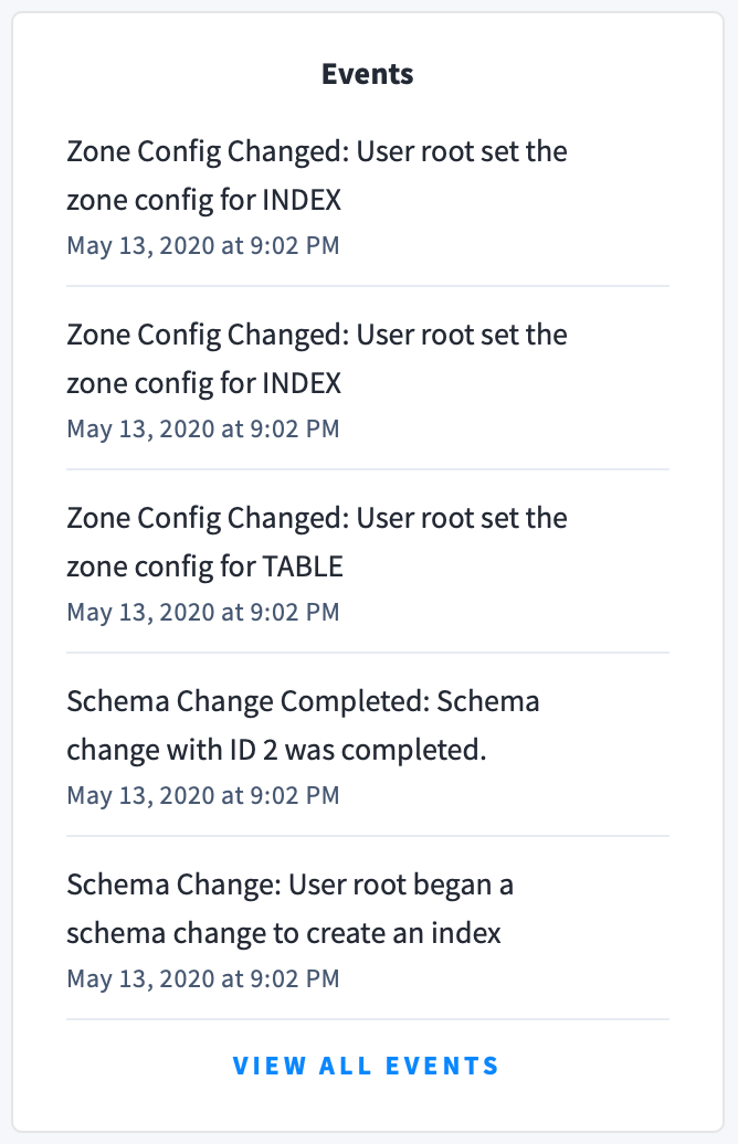
- Database created
- Database dropped
- Table created
- Table dropped
- Table altered
- Index created
- Index dropped
- View created
- View dropped
- Schema change reversed
- Schema change finished
- Node joined
- Node decommissioned
- Node restarted
- Cluster setting changed